Health insurance members who are often stressed, time-constrained, or unfamiliar with complex medical terminology.
It encompasses a group of external members and internal stakeholders who are impacted by the portal's performance.
The most direct impact is on the diverse groups of people trying to manage their health.
A successful all-in-one health insurance portal, we aim to balance member empowerment with operational efficiency.
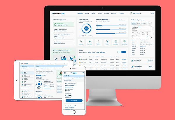
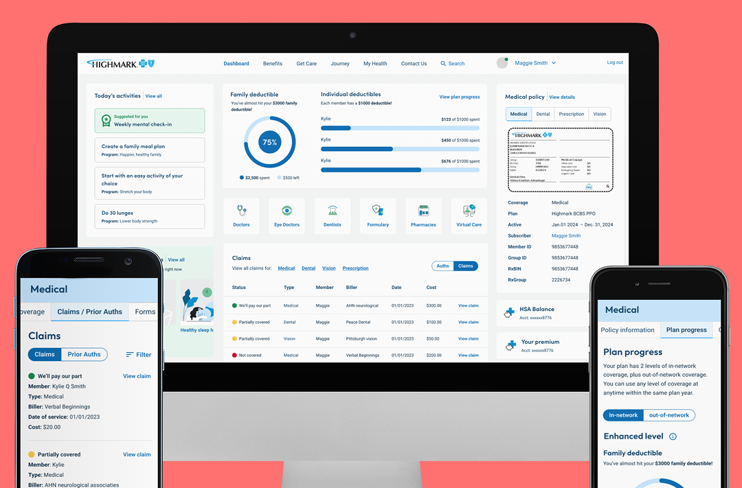
The portal feels overwhelming because a massive volume of features (claims, spending, virtual visits, etc.) is presented without clear visual hierarchy.
We aim to uncover the root causes of member friction and the business barriers to digital adoption.
When a member has an immediate health need or financial concern, making any navigation friction feel magnified by their current level of anxiety.
Typically expected 12 months after launch to account for seasonal health trends
The "Trust" Mandate: Patients in 2026 are demanding more transparency. Starting now allows for build "Security-by-Design" into hub.
On the member portal, specifically during "high-stakes" moments like checking coverage before a doctor's visit or disputing a claim.
Problems often occur at disjointed handoff points, such as when a member leaves the main portal to use an external tool.
Oscar solved the jargon and navigation problem by using cyclical information architecture and "Next Best Actions."
In a health insurance context, poor UX isn't just a minor annoyance—it's a barrier to care and a massive financial leak.
Poor findability leads to frustrated members, abandoned digital tasks, and an influx of expensive calls to customer support.
UX designers want a seamless flow, but the data latency between these siloed systems makes real-time updates nearly impossible.
Members lose trust about their health costs. The business suffers from reduced digital utilization and higher administrative overhead.
Transform the portal into a competitive moat. In a market where coverage options are often identical, the experience becomes the product.
Move toward a guided service model. The solution lies in bridging the gap between complex backend data and a high-stress user mindset.
| Situation | Motivation | Outcomes | Emotional Job | Social Job |
|---|---|---|---|---|
When...When I have a complex health need or a routine administrative task (like checking a claim status or finding a doctor)... |
I want to...I want to access all my health data and benefits in one clear, central place without jumping between different apps or portals... |
So I can...So I can confidently make health decisions, resolve financial tasks quickly, and focus on my recovery or wellness. |
Making me feel...Making me feel empowered, in control, and less anxious about the complexity of the healthcare system. |
Others see I’m...Others see I'm a responsible, proactive person who stays "on top of" their family’s health and finances. |
Using the Jobs to be Done (JTBD) framework for a unified health hub reveals several strategic insights that move beyond simple feature lists to focus on human-centered progress.
Members aren't looking for a "claims portal"; they are looking for financial peace of mind.
A design that is technically perfect but cold or confusing fails its primary job of making the user feel empowered.
A user checking rewards while at the gym has a different mental model than someone checking a claim status after a surgery.